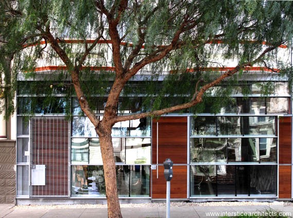
IA Office — Our "New" Space
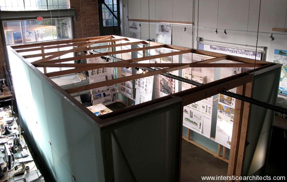
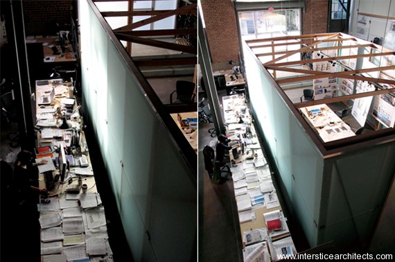
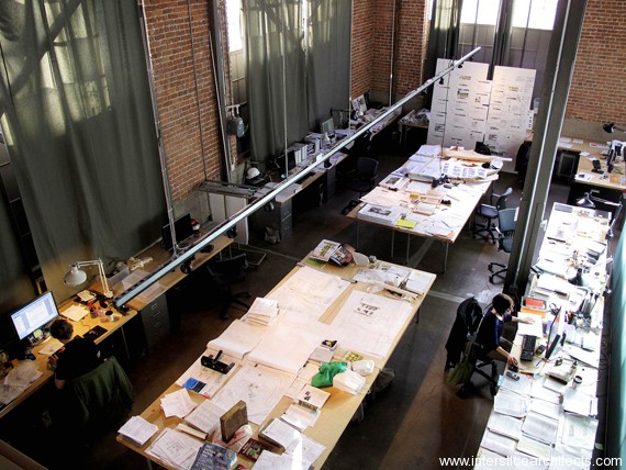
We thought we’d share our “new” office with everyone – “new” being a relative term as we’ve been working in our renovated warehouse space at 587 Shotwell Street for about a year now. Aside from a new kitchen, new lighting fixtures, and some custom furniture, our biggest improvement to the space has been the conference room, a.k.a. “The Cube.” The Cube’s clouded glass shell is 100% reclaimed material, sourced from local reclamation yards. The glass is mounted to a simple exposed wood structure, held in place by custom mounting brackets we fabricated in our shop.
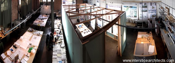
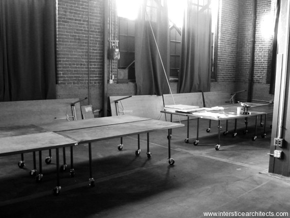
Before the Renovation
Featured Project: 3443 26th Street Facade
We’re pleased to share some photos of one of our projects completed earlier this year – our facade renovation at 3443 26th Street. Located in the Mission District, this two-story house’s first floor facade was completely redone using reclaimed sealed glazing units, sourced locally from area reclamation yards. The steel framing structure that houses the glass is built to accept a wide range of unit sizes, and the random assortment of units results in a facade with unique qualities of depth and reflection. IA looks at this project as a case study in researching how we might better re-incorporate waste-stream materials into new construction, and the detailing and construction know-how required to ensure the quality performance of the resulting structure.
You can see more photos of the project on our website.
Featured Project: Noel Barnhurst Studios
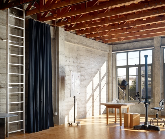
photo credit: Cesar Rubio
We’re happy to share some finished photography of our most recently completed project: the studios of Noel Barnhurst. We were asked to renovate a 1930’s era concrete warehouse located in San Francisco’s SOMA district to accommodate the client’s food photography studio as well as other associated program including test + preparation kitchens, as well as office + conference spaces. We appreciated the raw material character of the existing building and worked to preserve these elements while making sure new construction complemented the building’s existing material palette. Hand in hand with this strategy, we avoided creating hard partitions and opted instead for a series of heavy velour curtains to divide space — ensuring the spatial organization remained open-ended and keeping the physical presence of the building in focus.
You can see more images of the project on our website.
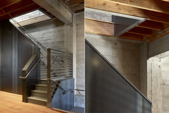
photo credit: Cesar Rubio
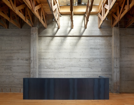
photo credit: Cesar Rubio
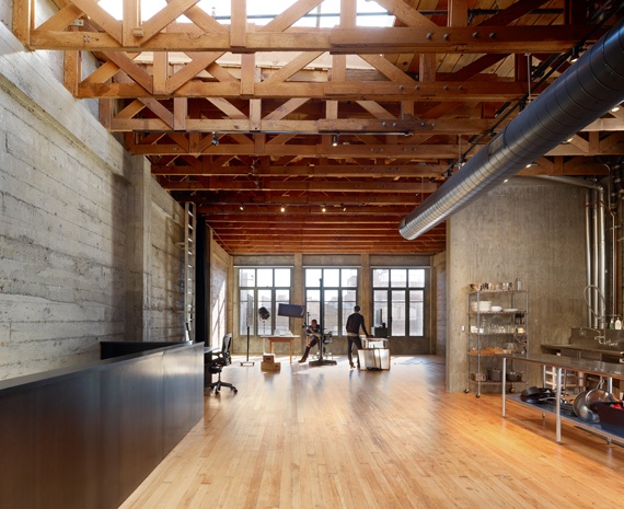
photo credit: Cesar Rubio

